Environmental Stewardship Design Contest
This contest was to create a logo for the HTH Organization's new tote bag representing environmental stewardship. I wanted to incorporate both the technological and environmental aspects. In the end, I was able to achieve this by using the gear for technology and a flower illusion for the environment. However, I went through multiple revisions and designs before I had something that I was content to turn in.
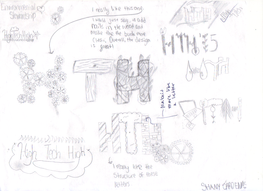
First Drafts
I had no idea where to start. Our teacher started giving us beautiful ideas but I honestly could not expand anymore on them. They were brilliant and original. I do not have the creativity to produce such amazing works. Here I just pretty much gave this whole design thing a shot and used a lot of my teacher's designs.
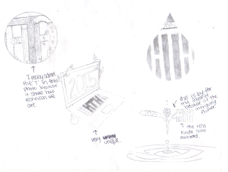
Second Draft
After getting some rough critique, I was able to polish some of my ideas. In addition, I became even more inspired by seeing my other classmate's progress in their design.
Decision Time
During my second draft I finally came down to a decision. I loved the idea of the design shown in the bottom right corner of my second draft shown above. It was unique and definitely incorporated both the environmental and technological aspects. I knew this was the design to choose.
First Step to Final
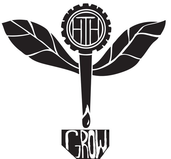
After having a set design, I went straight to my teacher for some critique because he's the expert! I had never done this before so I had no experience in this type of stuff! He did approve of the overall design and helped me turn it into a solid one. He helped me with the idea of putting HTH in the center since that was the main component we were referring to while still maintaining the gear look, made the leaves look more like leaves and advised me that the ripples was not the best choice. But we still wanted to incorporate the water somehow so we added a water drop that was still part of the stem. He helped me create a clean design.
Small Change
When we saw how it looked like on the tote-bag, I felt it looked awkward... The top part was big and wide while the bottom part was thin, it was just visually unbalanced. So we decided to add a pot (incorporating some more of the environmental aspect) to the bottom with the word "GROW" since at High Tech one of the key words is growing as not only a student but just as a person by going through real world problems and reflecting over decisions. The word felt just right and appropriate for the design since plants grow! So I created a quick sketch to see whether the pot would balance the "flower".
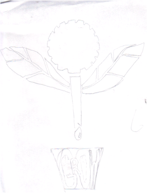
Final!
I liked the way the pot balanced everything and decided that was what I would do! Except instead of creating it on Adobe Illustrator, I decided to hand draw it to make the lettering easier and just scan it. Well here's the final result! I really am satisfied by the progress to get to this point!